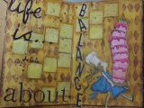

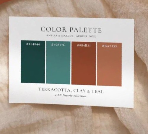

Monthly Color Challenge – Teal & Rusty Orange – I picked the colors from my stash, matching as close as possible.
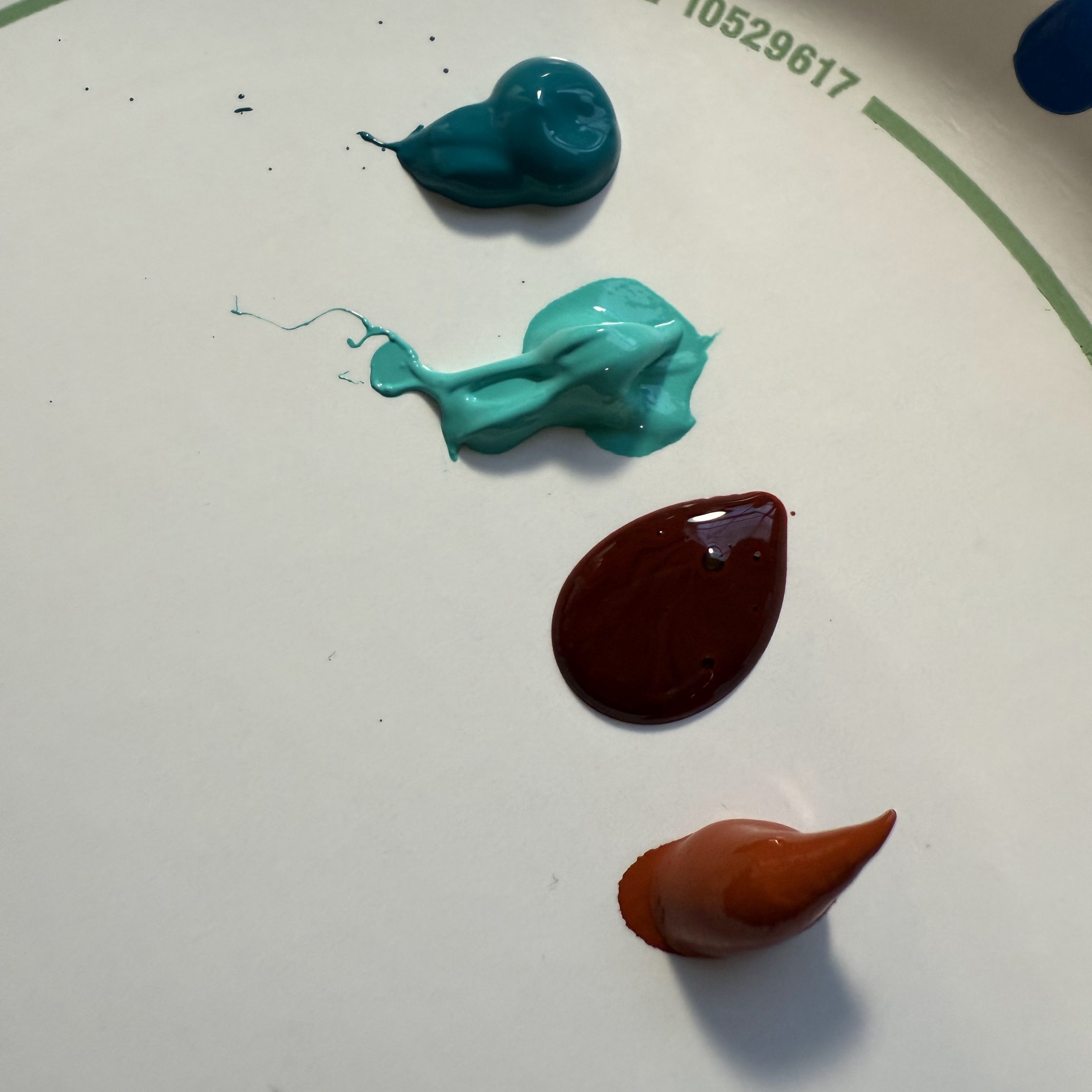
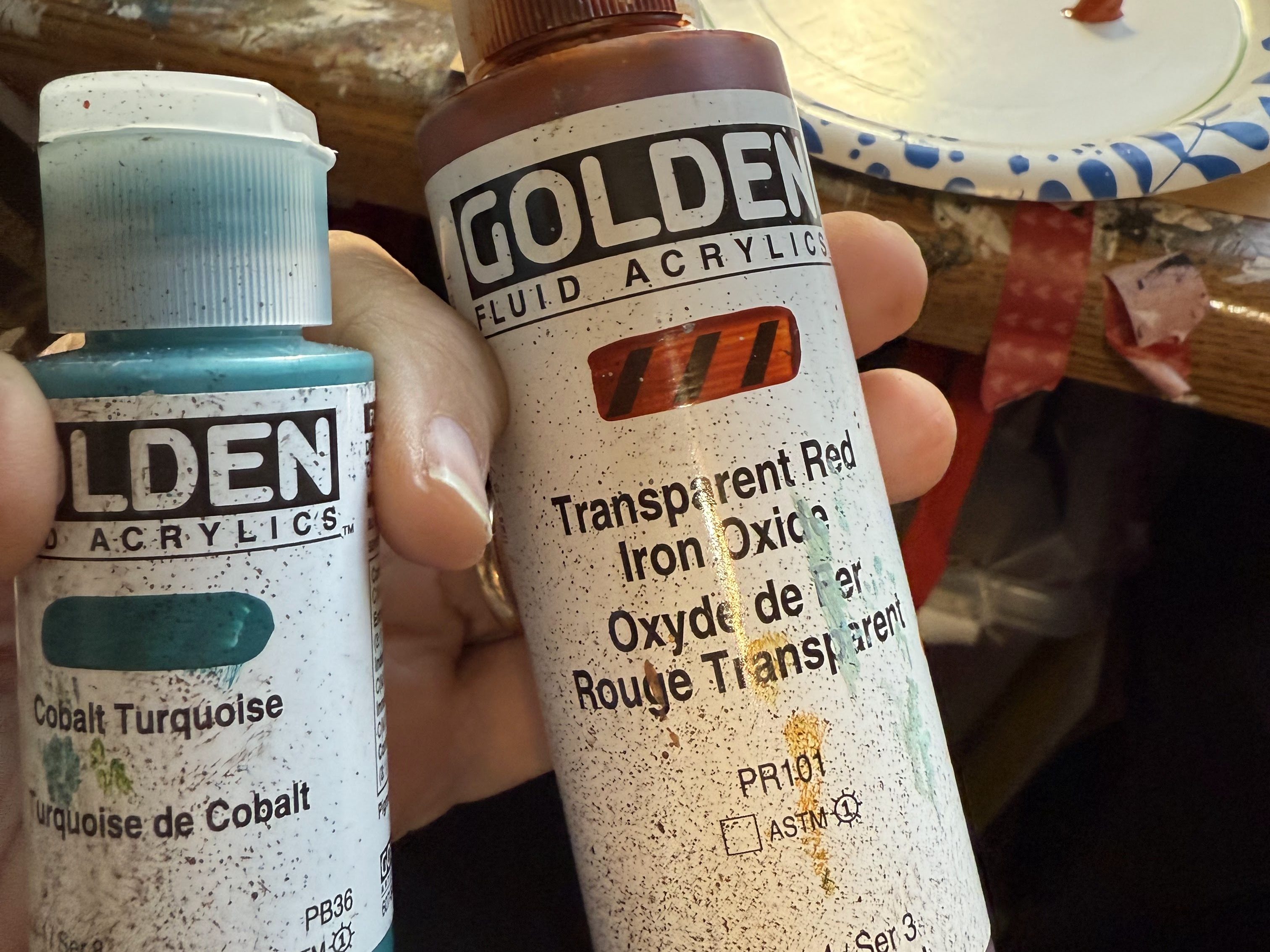
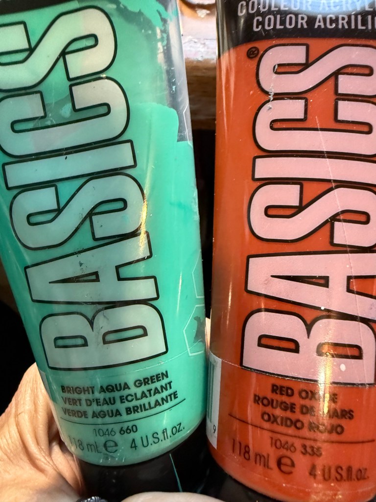
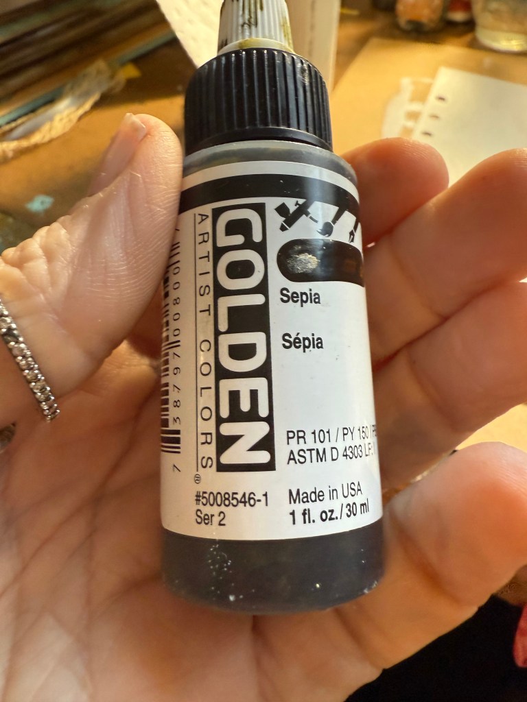
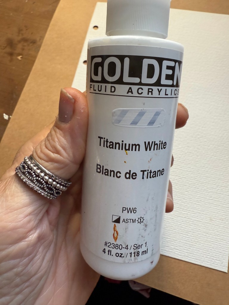
Golden – Cobalt Turquoise & Transparent Red Iron Oxide, Titanium White, Sepia. Basic – Bright Aqua Green and Red Oxide.
Wet Wipe Technique – Smooth paper for best effect.
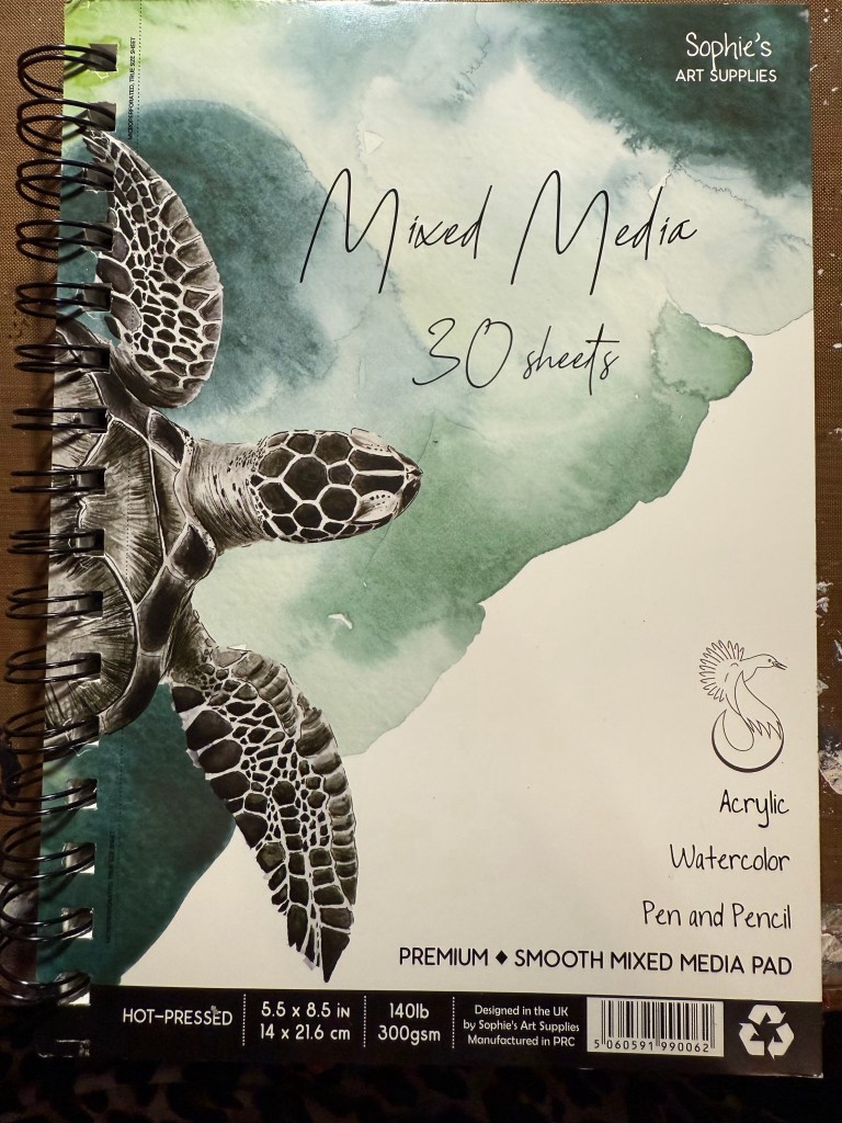
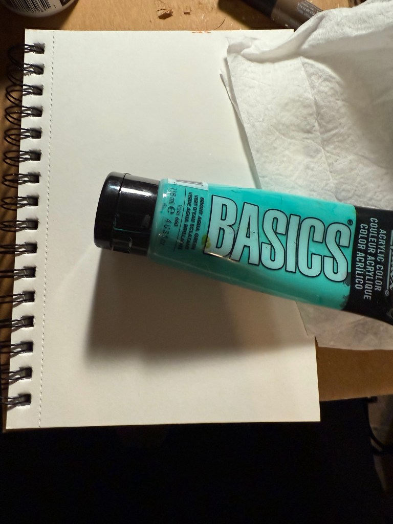
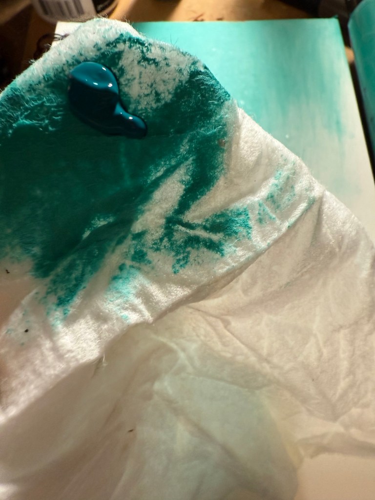
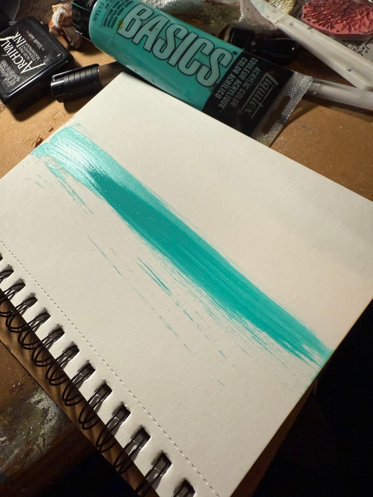
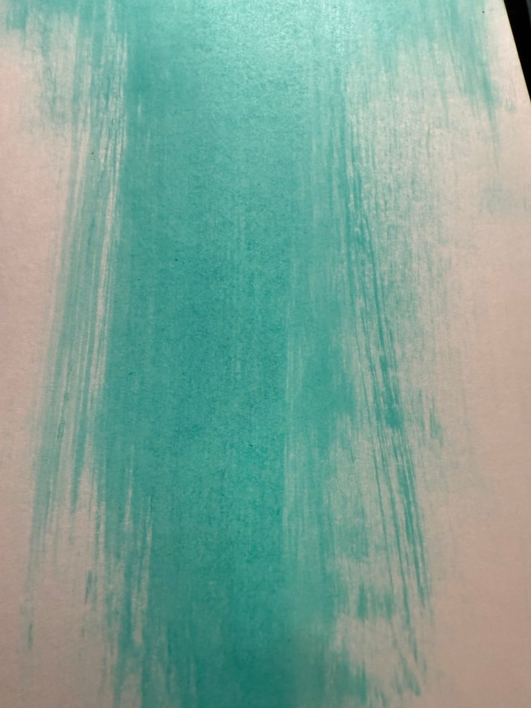
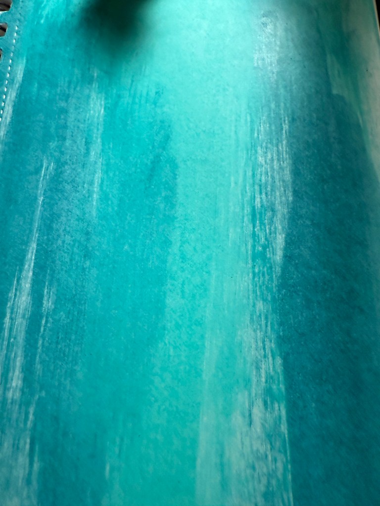
I used a Mixed Media paper with a smooth finish, Use a small amount of paint on a wet wipe – I add water if the wet wipe is dry – Wipe the wet wipe down the page and the smear up and down until no more paint goes on the paper. Add the next color in the same manner – buff between each color to make sure that the layer is thin and there is no more excess paint. Continue until you receive the desired effect you want. A more comprehensive Technique Video from Vickie Papaioannou https://youtu.be/gT5vn5QqNVo?si=4QClNQRE3cXrVgzs
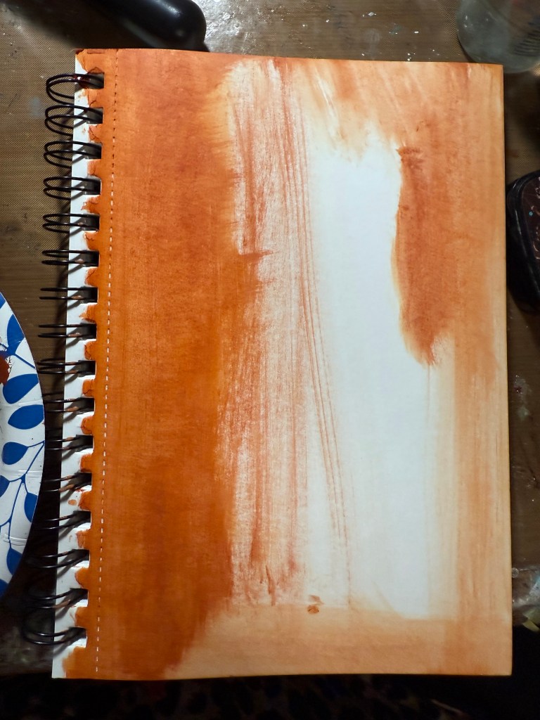
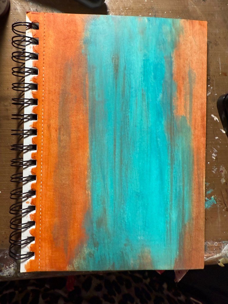
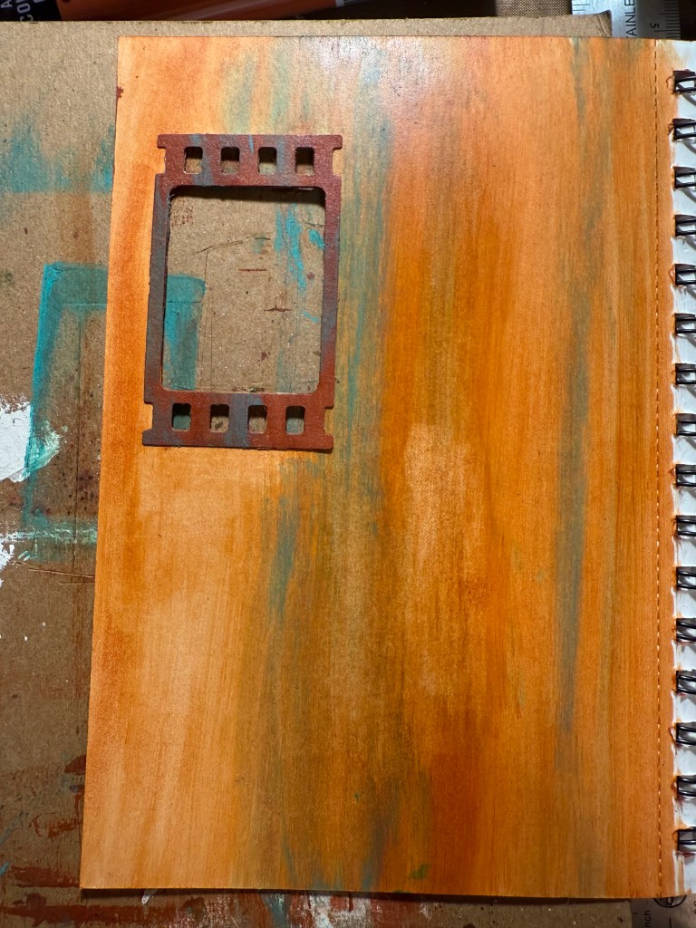
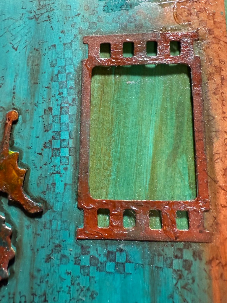
I wanted a bolder page I used the two orange paints first and the added the the blue in the same manner. I also love to add different windows in my projects. I used an older die from Tim Holtz for a film stripe.
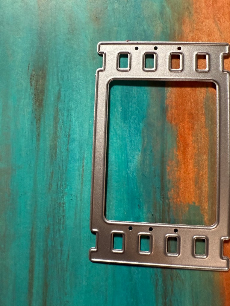
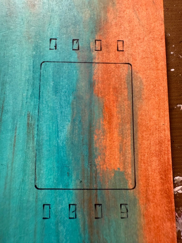
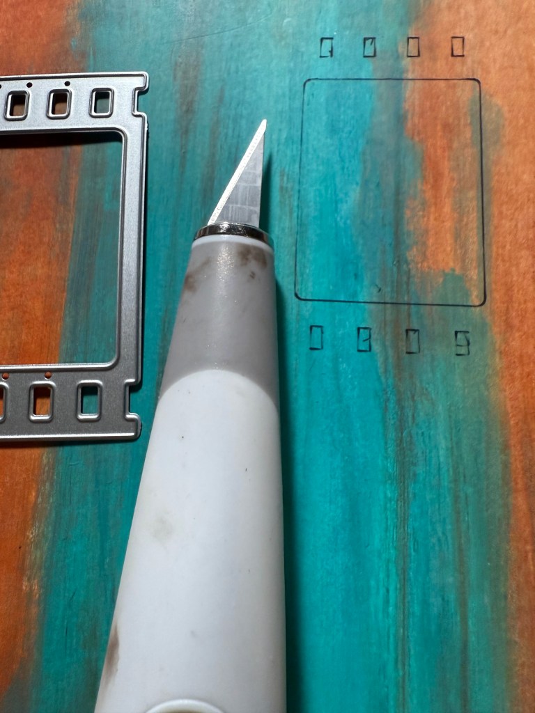
I marked the page and then cut out with a knife, slightly around the image.
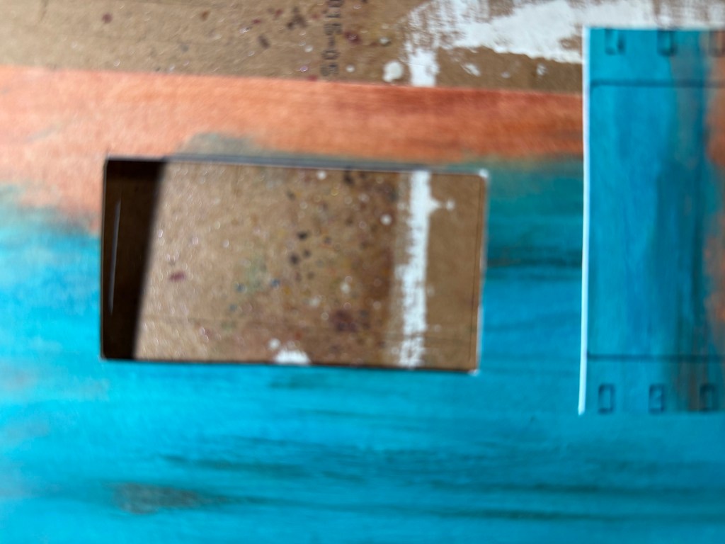
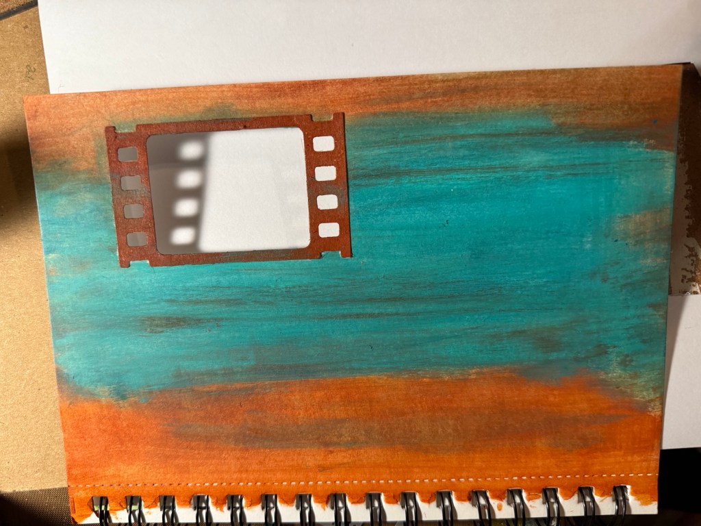
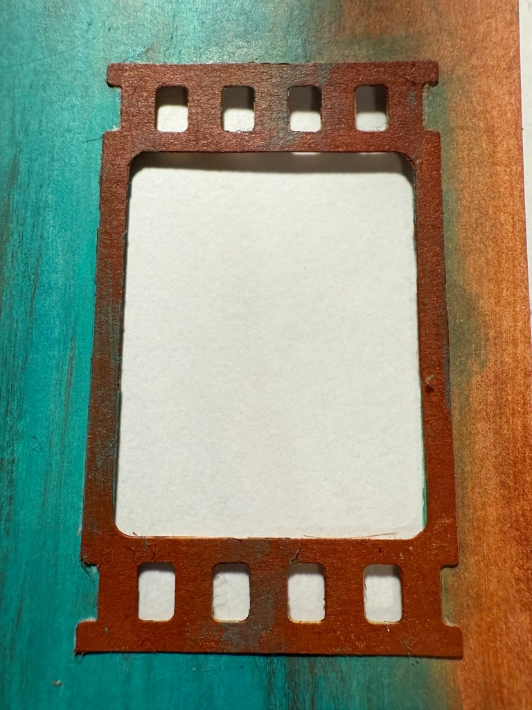
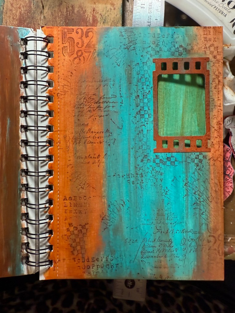
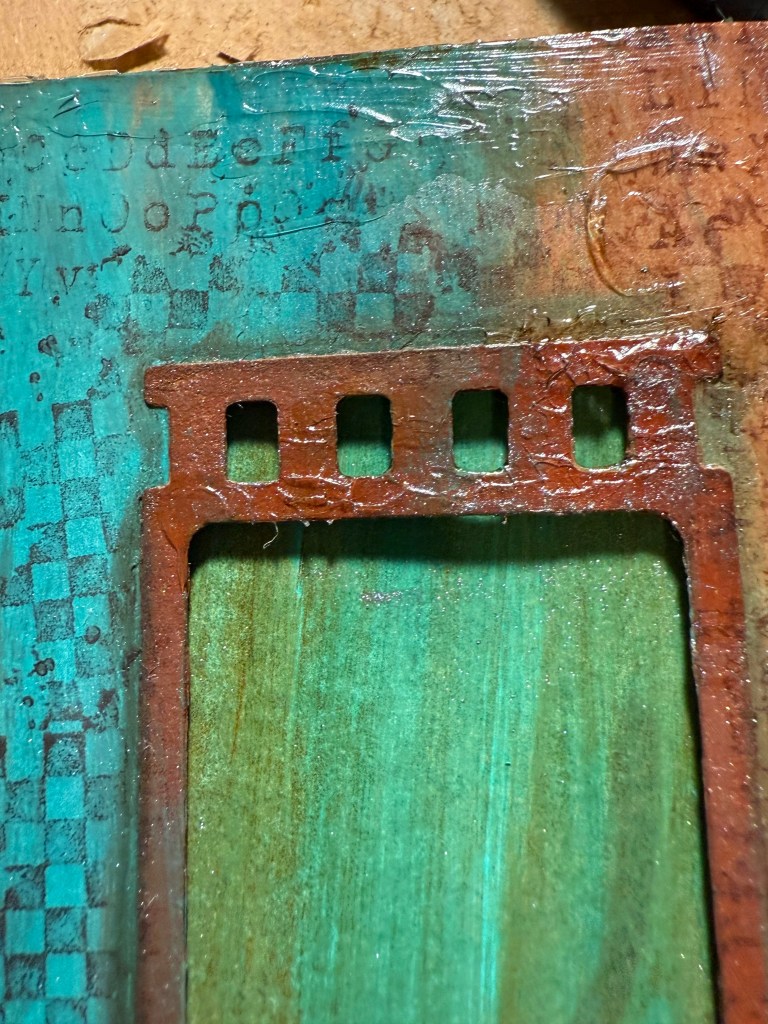
I then used the die to cut out two die cuts. I had to make adjustments to the cut out to make sure that the background did not show thru the die cuts. I painted the die cuts with the paint, using the darker colors for a better contrast. i then glued the die cuts to the front an back of the pages. I did paint the back side of the book with the baby wipe technique. See below.

I then used Tim Holtz stamps to build up the background. Ultimate Grunge CMS075, Perspective CMS213 & Ledger Script CMS241. Versafine Clair Pine Cone Ink – You can also use the Archival Inks from Tim Holtz.

I used a GRUNGY Die cut from my stash. I will add a video for this technique below- I used matte Medium to adhere the image to the page – I also used it to cover the entire page. https://youtu.be/xlffXgu_B0U – I will make a technique video later this year for this effect.
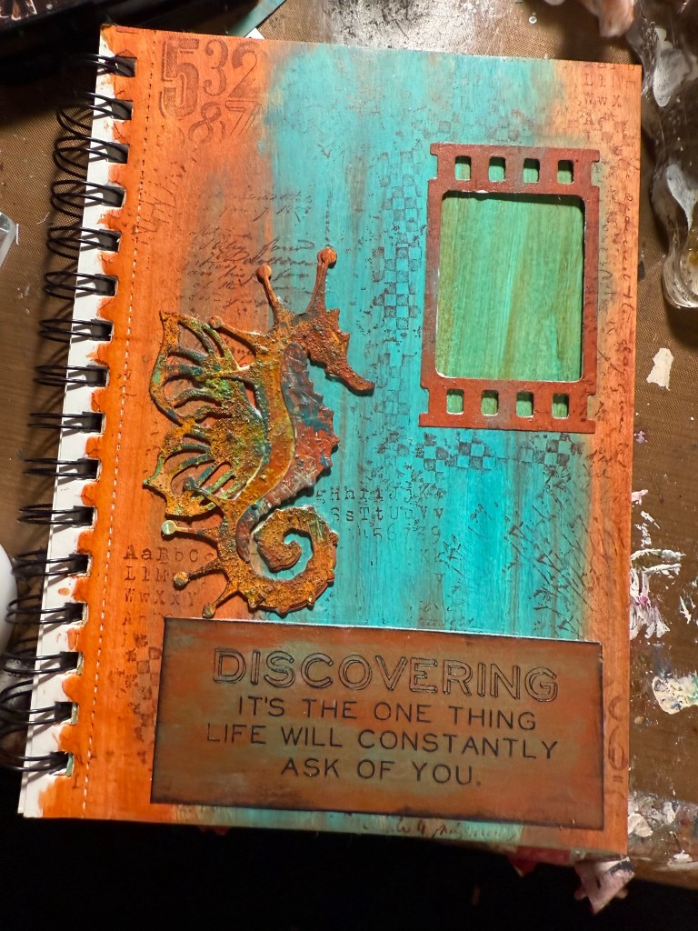
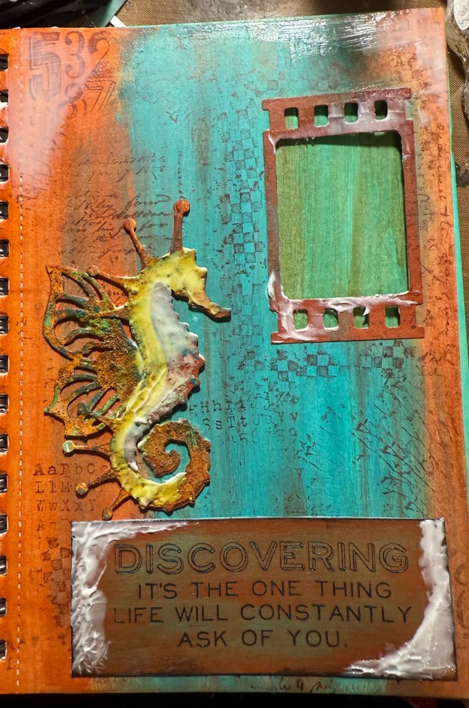
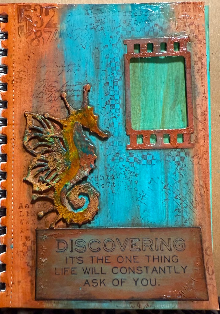
I used the Tim Holtz Stamp Perspective CMS213 for the sentiment. I used the VersaFine Clair Pine Cone Ink and them embossed with Ranger clear fine embossing powder. I then used Ranger Tim Holtz Translucent Crackle paste around the edge and on the die cuts. I let this dry for about an hour.
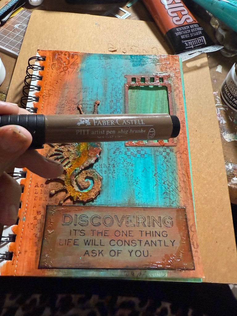
I used the Faber Castell Indian Ink – Big brush Marker in brown to shade the dies cuts and Sentiment. I marked with the ink around the edges, and then quickly smudged the edges to make a shadow. 12.18 minute on you tube for big brush marker technique https://youtu.be/3mTcvKGERDM?si=ScAy6YwLQumjt5wJ
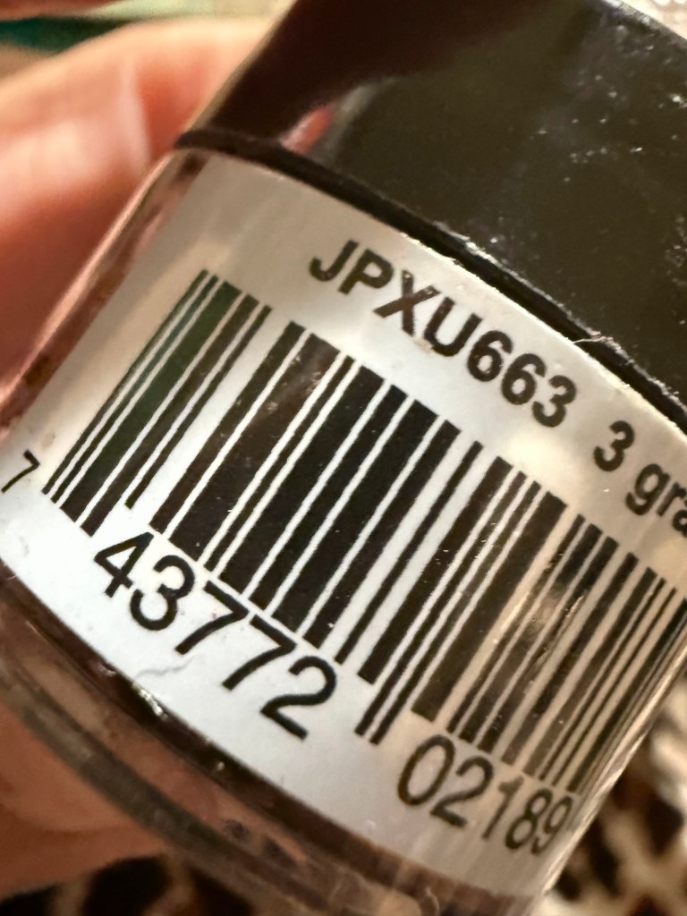
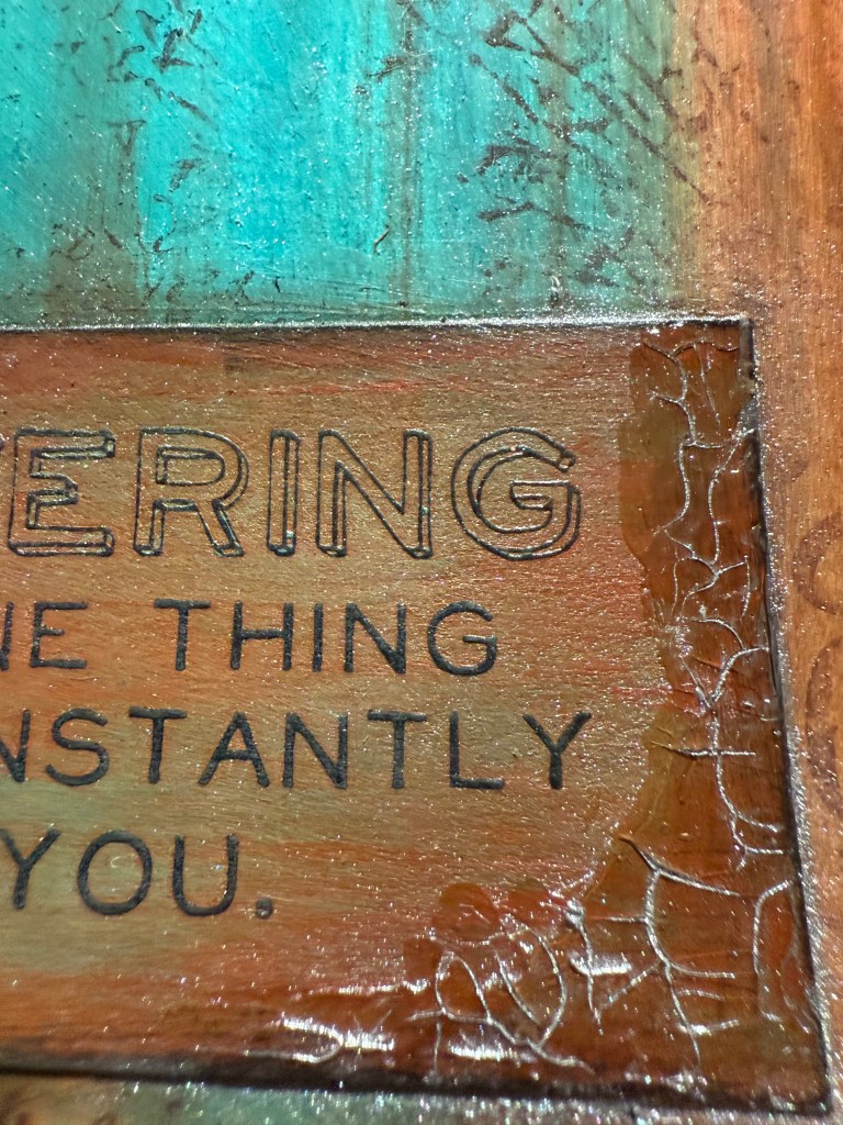
I used Pearl Ex JPXU663 – This is a silver color – to highlight the cracks in the Crackle Paste – A dark brown color would be good also to darken the cracks.
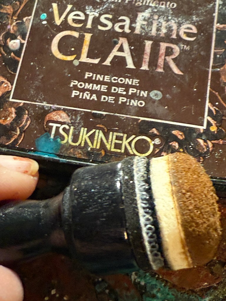
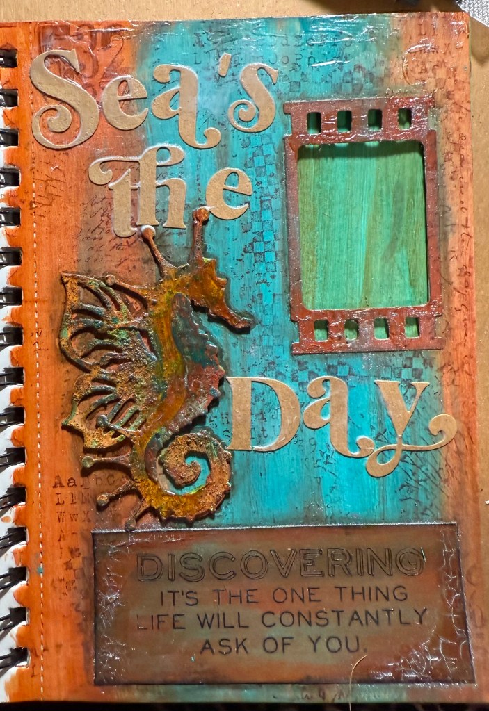
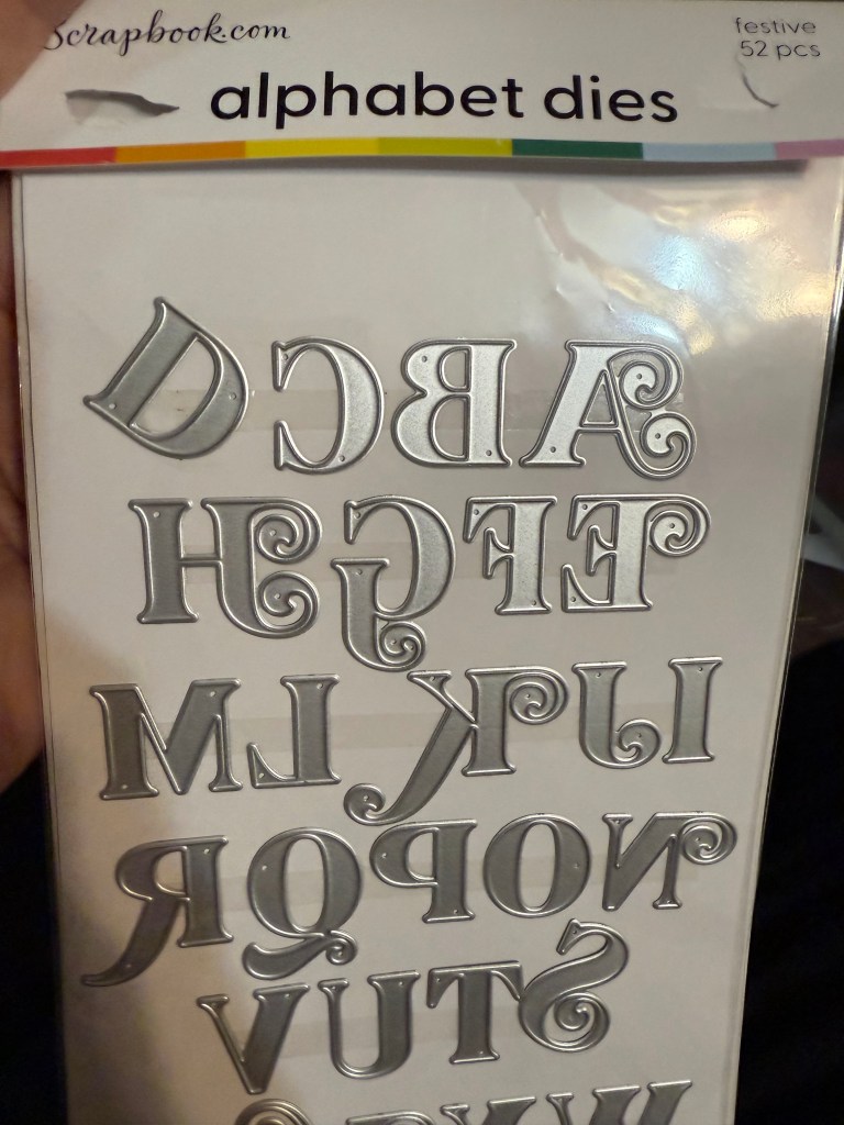
I used Pine Cone Ink and sponge to darken the edges of the page and used an Alphabet Die from Scrapbook.com for the main sentiment. “Sea’s the Day”
I used a White uniball Signo Broad pen to add the high lights and watered down the white paint and splattered the page.
